Blog posts


Behind Weblaunch Nova part 2
September 10th 2021
Written by Weblaunch Team
Evolving from our past
Continuing from part 1, we decided to rewrite Weblaunch. To symbolise the change, we chose to redesign the brand.
First draft
Our first draft consisted of two things: A glass and a gradient. All text except on the navbar was black, and buttons were either white or blue. The new logo started as a minimalistic white rocket, with a circle around it.
After a few weeks of working on the app, we got tired of the design. The gradient didn't match the other colours, and the logo was way too light and outlined to present the Weblaunch identity. All in all, the design did not represent the upgrade from WL2.
Colours
After throwing away the first draft, we took small and careful steps to avoid failing again. Weblaunch's identity colour was blue, and we didn't want to change that. The result was four new blue colours, named after their brightness. At this point, we had to choose: Design our components based on a light or dark theme. We chose light mode due to a couple of reasons. The introduction of Windows 11, which defaults around a light theme, made us make the final decision. (Nova dark theme will come eventually).
Corners
The buttons in WL2 consisted of one border-radius. I WL3, the border-radius is based on the size and the setting of the button/element.
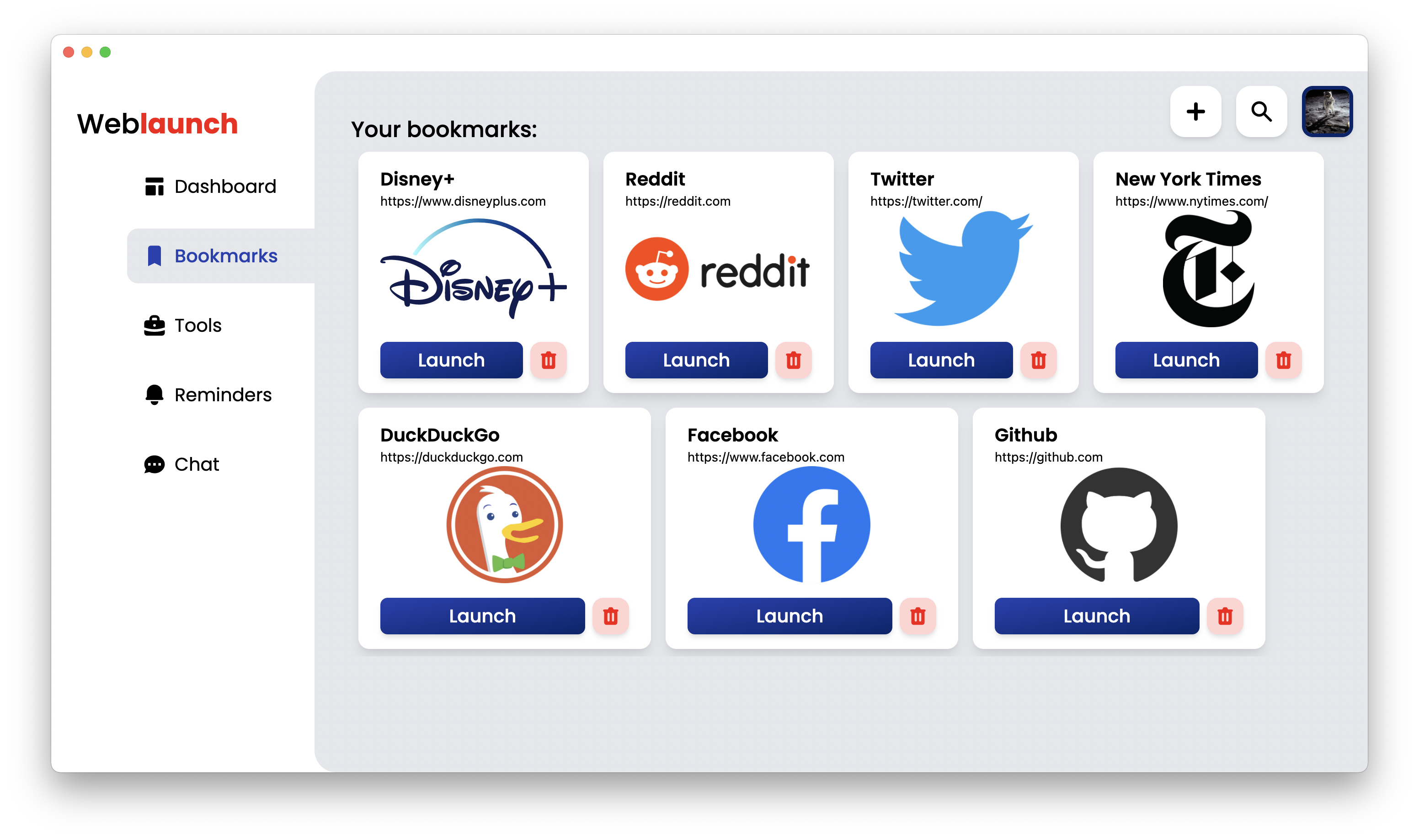
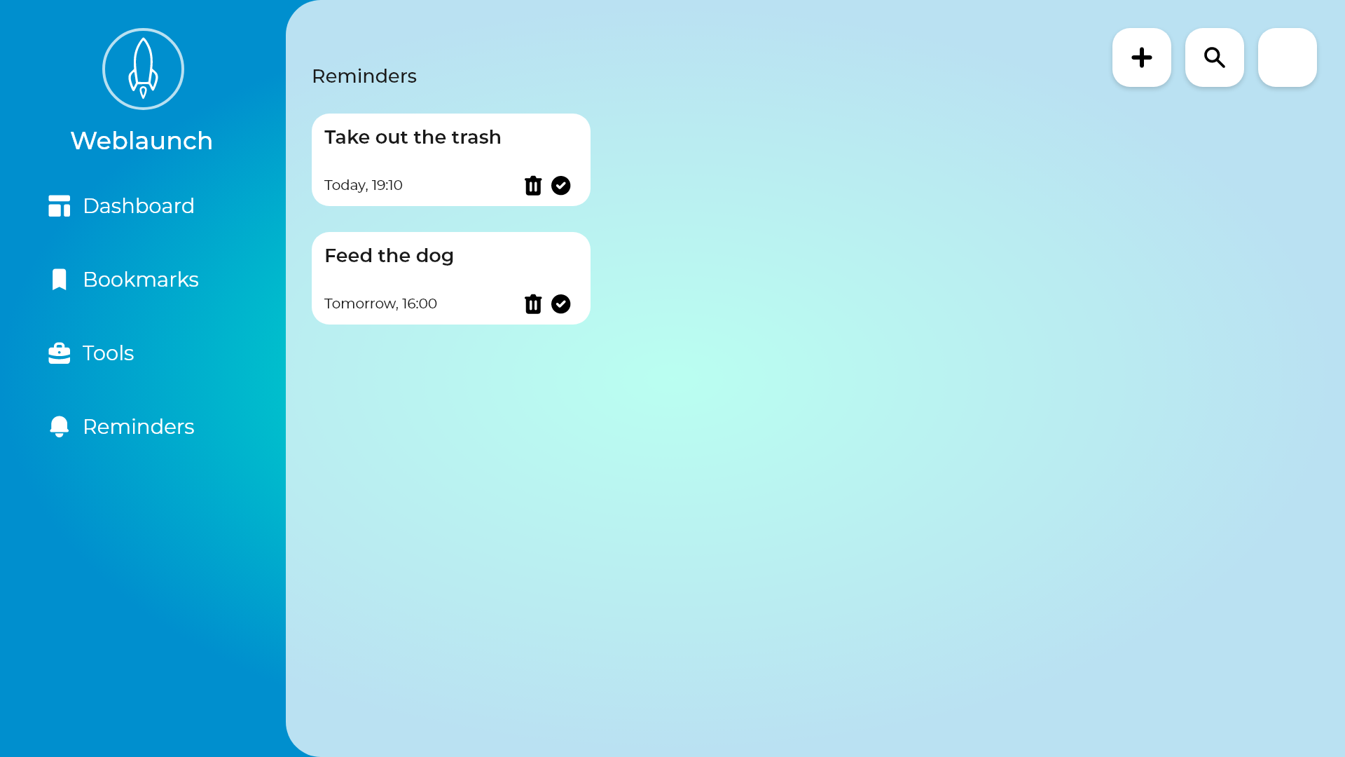
Second draft
With the mentioned features in the design, we started our second draft. It ended up being our final result. Meet the Nova design.